



Accent, Identity, and Tilework
In Iran, almost every city you go to, people have their own accent—except Tehranis, who are neither here nor there. Of course, many capitals around the world are becoming more and more identity-less every day. But it still gets to me when I see younger people in other cities trying their hardest to hide their accents and talk like us Tehranis, for example. As if we’re such a prize! An accent is color, identity, pattern; it’s the result of generations of cultural accumulation. Just like tilework in Iranian architecture.
Yes, I said all that just to get to tilework in Iranian architecture. But not a technical, precise piece about it—more of a felt experience. To me, Iranian tilework has an accent. Wherever you go, even if you’re completely clueless about tilework like me, you can still feel the differences.
Kashan and Natanz: From Lusterware to Muqarnas
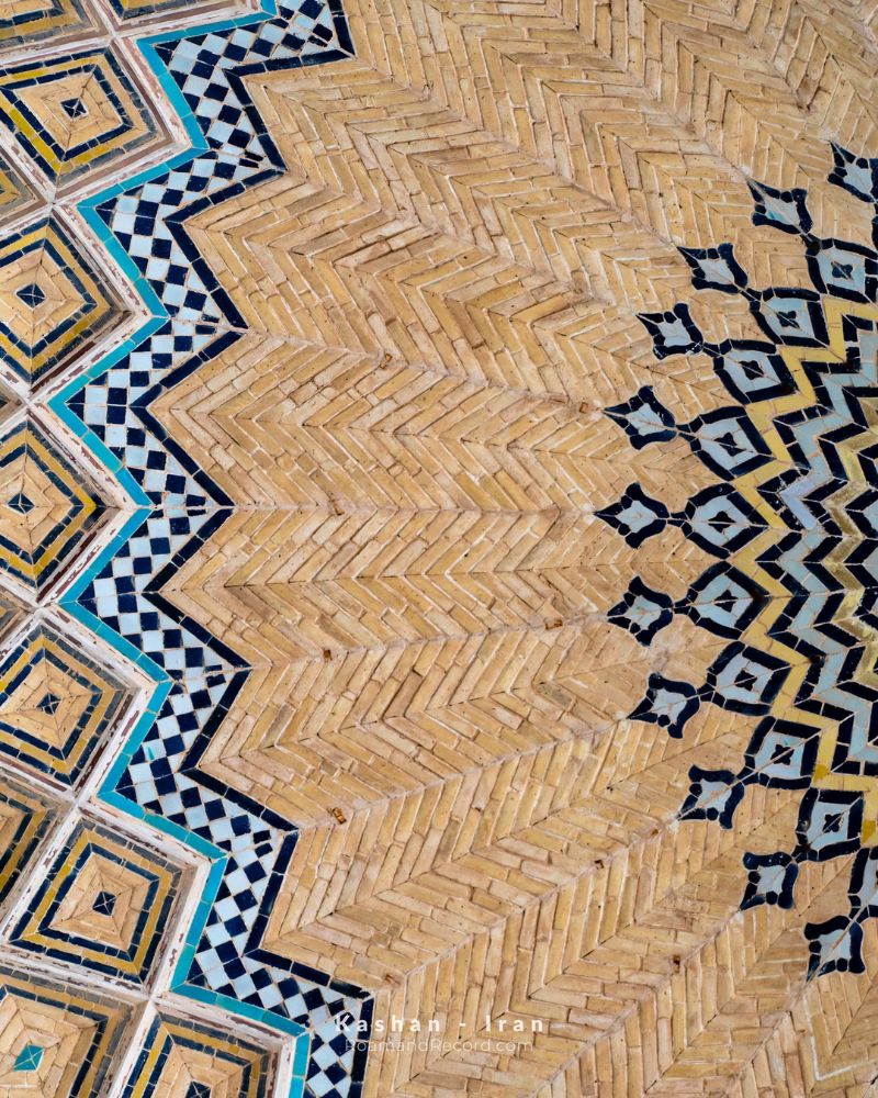
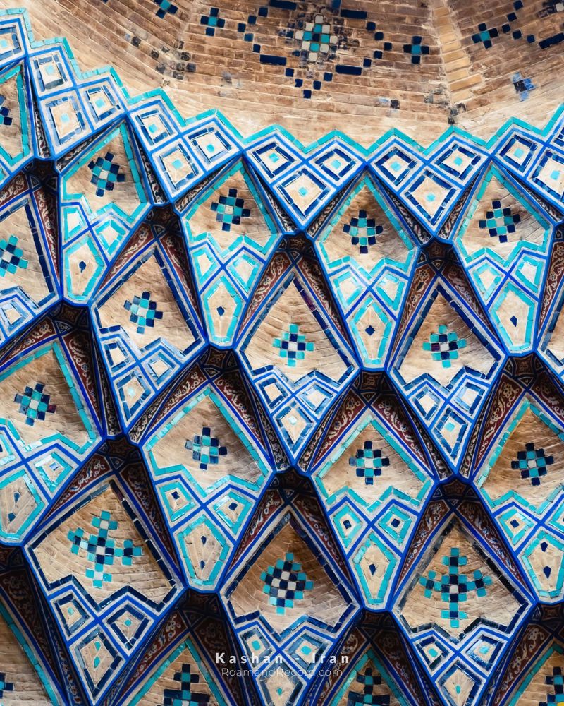
Let’s start with Kashan. In Persian, people from Kashan are also called “Kashi”—the exact same word as “tile” in its architectural sense. During the medieval Islamic period, potters from Kashan were remarkably skilled at making lusterware tiles: surfaces that, under light, didn’t just reflect a single color but took on a metallic, shifting glow. Maybe one of the main reasons for using these tiles was the way light played and shimmered on them in dim interior spaces.
A quick technical aside: tilework is usually done in two ways. In mosaic tilework (kashi-e moarraq), small pieces of different colored tiles are cut separately and put together like puzzle pieces. Puzzle lovers will get a real kick out of seeing this kind of tile! The boundary between colors is the boundary between actual pieces; every line and curve of the pattern comes from independent pieces sitting next to each other. But in seven-color tilework (haft-rang), the pattern is painted onto larger pieces—usually all the same size. After glazing and firing, several colors and patterns can come together on a single tile.
For artists in the past, it didn’t matter whether the tile was meant to cover the dome of a mosque, the ceiling of a public bathhouse, the house of a wealthy merchant, or a corridor in the city’s grand bazaar. Either way, they gave it their all so the finished work would have soul. And today, when we look at what they pulled off, there’s no denying their work is still alive.
Once you get a little way out of Kashan, the tilework’s accent changes—maybe not by much, just about the distance from Kashan to Natanz. In Natanz, at the Sheikh Abd al-Samad complex, the mix of tile, brick, and plaster creates a distinct architectural language. The entrance portal, with its multi-layered muqarnas, has not only patterned surfaces but also volumes that spill out of one another and pull your eye upward. Turquoise and lapis lazuli tiles sit alongside white plaster and warm brick on these very volumes. As the surface and depth shift, the patterns go beyond a flat image. Here, telling tilework apart from architecture may not be such an easy job after all.
Isfahan: When Tilework Becomes Poetry
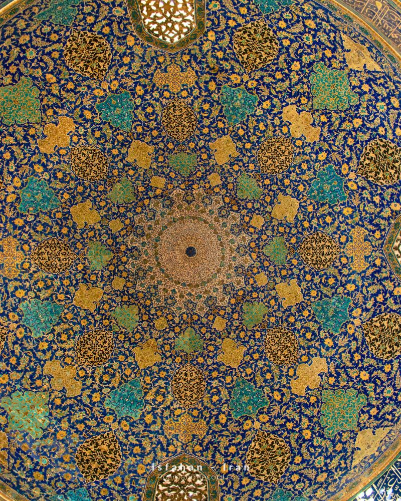
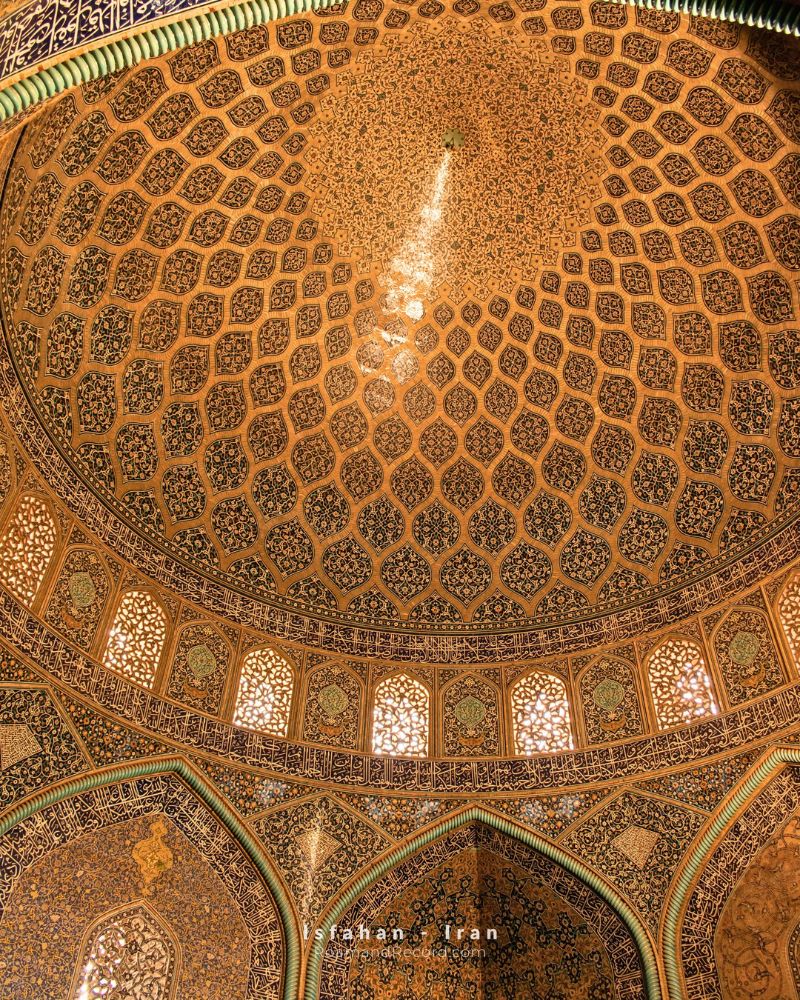
Kashan and Natanz are amazing, but the grandeur and glory of this Iranian art reach their peak in Isfahan. Believe me, when you visit Isfahan, you can’t really blame the locals for calling it “half the world.” If tilework in Kashan is a literary text, then in Isfahan it’s a grand poem unfolding right before your eyes.
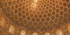
In many Safavid buildings, tilework goes far beyond the entrance and the iwan and covers domes, curved surfaces, and large stretches of the building. Repeating geometric patterns, swirling arabesques, and inscriptions turn the surface into one continuous order. In a maze full of twists and turns, your eyes wander back and forth, and somewhere along the way, when you lose track of the pattern, you suddenly realize you’re back at the starting point, staring at the designs again.
In Isfahan, the difference between mosaic tilework and seven-color tilework is part of the story too. In mosaic tilework, the boundaries between pieces and the precision of the cuts give the lines of the pattern a tangible quality. In seven-color tilework, being able to paint a varied set of colors onto larger tiles makes it easier to cover big surfaces. These two methods were used side by side in the Safavid period, but their visual results aren’t always the same. Sometimes the pattern is built out of colored pieces, and sometimes it sits on the surface as one continuous picture, like a painting.
Maybe that’s why, when we’re inside Isfahan’s buildings, we lose the architecture. Your eye roams among the patterns, notices the differences, and goes looking for different colors. The dome, the iwan, the muqarnas, and the inscription—each one is part of one long sentence. Beauty isn’t just in a single flower or star; its meaning lies in the relationship that flower or star builds with the whole surface.
Isfahan: Two Faiths, Two Visual Accents
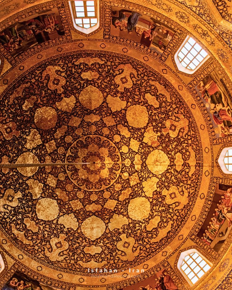
Now let’s take the surprise up a notch. A few kilometers past the Shah Mosque in Isfahan, you’ll find Vank Cathedral. The whole neighborhood is the Armenian quarter. Bethlehem Church is right there too. The architecture of these buildings is heavily influenced by Iranian architecture, and tilework is a key part of their interior design—but with one small difference: the accent shifts again.
Once again, you’ve got geometry, inscriptions, arabesques, and repeating patterns. But narrative painting—a hallmark of Christian church art—also makes its way into the mix. In the showdown between a mosque and a church in one historic city, we’re looking at two different ways of representing the sacred: in one, the order of patterns and script can shape a spiritual space; in the other, visual storytelling, faces, and events take center stage.
Of course, we shouldn’t reduce this to some simple mosque-versus-church dichotomy. Religious architecture in both traditions is diverse, and every building has its own history and decorative logic. Vank and Bethlehem aren’t just two churches with a few pictures in them. They’re buildings where Iranian and Armenian architectural and artistic traditions sit side by side. Maybe the appeal is exactly in that pairing: two cultures talking about the sacred haven’t necessarily picked one single visual accent. Believe me, the interior decoration of the Armenian churches in Isfahan doesn’t look like any church anywhere else in the world.
Yazd: The War Between the Silence of Mudbrick and the Cry of Tile
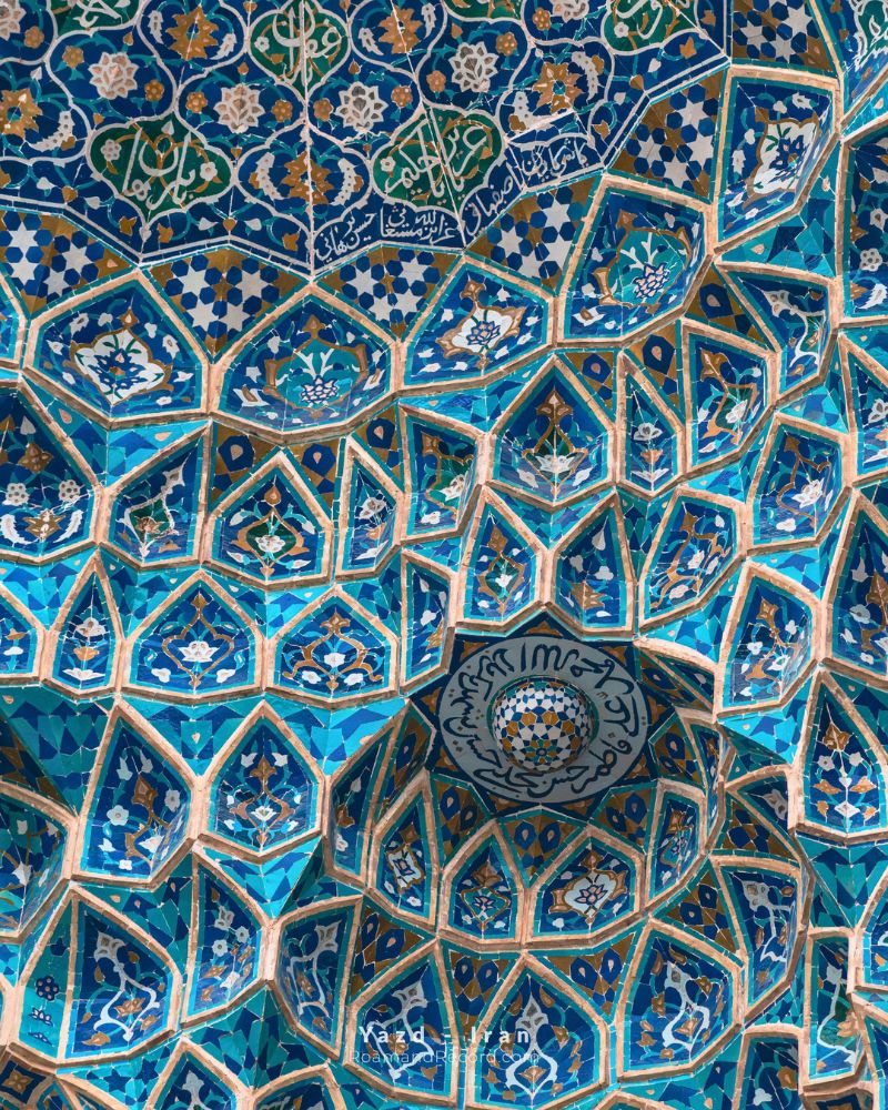
Let’s drive four hours south from Isfahan, and we’re in Yazd. For me, Yazd is the very picture of the sanctity of water—the grueling human effort to bring a trickle of water from hundreds of kilometers away to people who, for the simple flow of life, don’t need anything more essential than water.
But tilework in Yazdi architecture has its own accent too. Maybe that desert struggle left its mark on the color and character of their tiles. In Yazd, you have to step back a bit from the tile itself and look at the background it’s sitting in. Turquoise on a brick wall or next to mudbrick isn’t the same as turquoise on a surface completely covered in tile. In mudbrick architecture, the contrast between the color of earth and the shine of glaze can hit harder. A small tiled surface, surrounded by simple volumes and earthy colors, sometimes stands out more than a whole wall covered in decoration. In Yazd, it’s a war between the silence of mudbrick and the cry of glazed tile!
Tehran: When Tilework Goes Modern Too
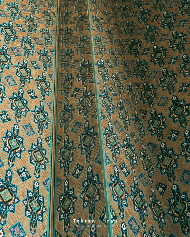
Let’s head back to Tehran—the same identity-less capital we live in. Tehran, especially in buildings from the Qajar period, gives you a chance to hear a different sound. In the tilework of Golestan Palace, you can see flowers and shrubs, landscapes, figures, and narrative scenes alongside traditional patterns. Here, tile sometimes steps away from geometry and repetition and turns into a surface for telling stories.
Technically speaking, Qajar tilework isn’t all one piece either. Alongside mosaic tiles and geometric patterns, methods like painting on glaze and the cuerda seca technique were used—a method where separating lines keep the glaze colors from mixing during firing.
This poetic quality in architecture isn’t limited to Qajar buildings either. At Niavaran Palace, when I was coming out of its central library building, I couldn’t take my eyes off the exterior tilework. But there was one small problem: the tilework’s accent had gone modern—like the building itself, which was a modern building, like us Tehranis’ accent that has supposedly become “modern.” Though I can’t quite bring myself to judge the tilework of Niavaran Palace by the same standards I use for the accents spoken by Tehranis.
Venice: When an Accent Turns into a Whole Other Language
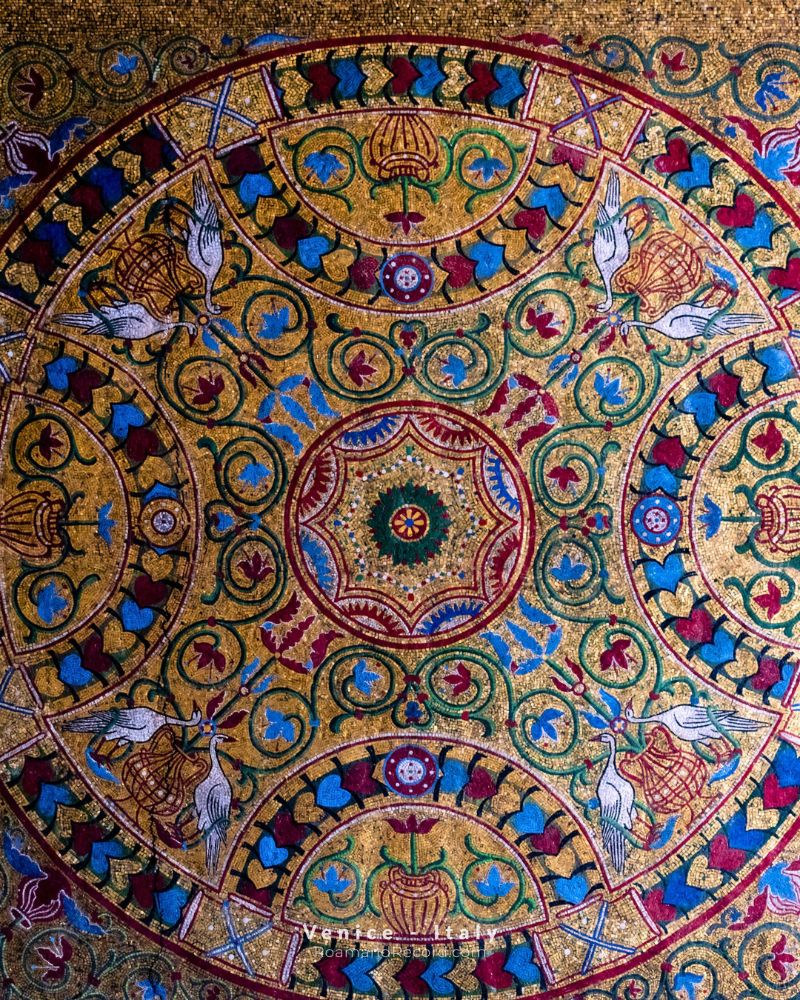
Now we need to get on a plane. I want to take us to Venice—St. Mark’s Square and its church.
At St. Mark’s Basilica, we run into mosaics that, in many places, are made from tiny pieces of glass and shimmering materials—surfaces that reflect light in a very different way from Iranian glazed tiles. In the golden mosaics, color isn’t just sitting on the surface; the shimmer of the material, the angle you’re looking from, and the light around you all play a part in the final experience. As you move, a surface that looked calm and even a second ago can suddenly come alive and start buzzing.
Of course, mosaic and tilework aren’t two perfectly interchangeable terms, and they come from different technical traditions. I think by now we’ve gone beyond a change of accent. The language has changed here. We’ve gone from Persian to Italian. But what matters to me isn’t treating them as the same thing—it’s comparing the experience they create in space. In both, small pieces come together to make a bigger picture, but the material of the pieces, the way they’re put together, the subject of the image, and its relationship with the architecture all change the result.
Architecture: Beyond Language, with Countless Accents
In Iran, I didn’t talk about Tabriz, I didn’t talk about Shiraz, or Bandar Abbas, Ilam, Khorasan, Kerman, Kermanshah, and plenty of other accents in this land. Even when looking at the bigger picture globally, I only talked about Venice and didn’t write a word about Barcelona, Rome, Valencia, Marseille, and Mallorca.
But the result is the same either way. Architecture, along with the unified ways it uses to express its building sentences, has different accents in addition to different languages. As a tourist, not only can we make the pleasure of looking even greater by emotionally understanding these accents, but I believe it’s our duty to grasp the sensory and experiential differences and, if we can, pass these experiences on to the next generations.